Hidden Language of Color: What Your Favorite Colors Reveal About Your Mind and Mood
We usually think of color as a simple aesthetic choice: a blue shirt, a red lipstick, a green wall. But the colors you gravitate toward—and the ones you instinctively avoid—can act like a quiet emotional signal, reflecting what you may be craving, resisting, or processing beneath the surface. Color preference isn’t just “taste”; it can mirror mood, desire, and inner tension in surprisingly personal ways.
Why Color Feels So Personal (Even When You Don’t Overthink It)
Color often “lands” in the body before it lands in the mind. You don’t always choose it logically; you respond to it. That’s why a shade can feel comforting, irritating, intense, or soothing—sometimes without a clear reason.
Colors can function like an unspoken language:
- They can stir emotion quickly (comfort, excitement, calm, unease).
- They can trigger memory (a place, a person, a time in your life).
- They can shape atmosphere in what you wear or how you decorate your space.
At the same time, color meanings aren’t universal. Culture can assign meanings (for example, a color associated with purity in one place may symbolize mourning in another). Still, beyond cultural codes, your relationship with color remains intensely personal—shaped by lived experience and emotional context.
The Core Idea: Colors Don’t Just Express You—They Can “Select” You
One of the most striking ways to look at color preference is this: what if the colors you’re drawn to are responding to what’s happening inside you—before you can name it? In other words, you may be reaching for certain tones because they match (or counterbalance) your internal state.
This is why color can be read as an “emotional compass”—not to label you permanently, but to offer clues about what you might need right now.
What Specific Colors May Suggest (Based on Common Emotional Associations)
Below are meaning-patterns often associated with certain colors. Treat these as signals to explore, not strict definitions. The most accurate interpretation is the one that resonates with your real life.
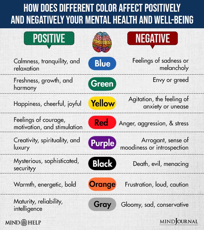
1) Red: Intensity, Energy, Momentum
Red is often described as bold, fiery, and charged. It can be connected to:
- Drive and confidence
- Passion and urgency
- A push to break out of emotional dullness or fatigue
It can also surface when someone feels restless or internally “switched on,” wanting movement or change.
Practical reflection:
- Are you craving visibility, action, or a fresh start?
- Are you energized—or feeling pressured to perform?
2) Blue: Calm, Clarity, Space to Breathe
Blue is commonly linked to calm and mental clarity—a “quiet refuge” for the mind. Yet, it can also hint at:
- Distance (needing space from people or noise)
- Solitude (protecting your inner world)
- A phase of healing or emotional reset
Practical reflection:
- Are you searching for peace, stability, or emotional relief?
- Do you need closeness—or do you need room?
3) Purple: Transition, Introspection, Inner Growth
Purple tends to show up in periods of transition—when you’re evolving, letting go, or stepping into a new chapter. It is often tied to:
- Introspection
- Transformation
- A desire for deeper meaning or self-understanding
Practical reflection:
- What are you outgrowing right now?
- Are you changing quietly, even if your life looks the same on the outside?
4) Green: Renewal, Comfort, “Permission to Breathe”
Even when not analyzed, greens (like sage, olive, forest) are frequently chosen when someone wants:
- Comfort and steadiness
- A sense of renewal
- A calmer, safer emotional rhythm
Practical reflection:
- Where do you need relief or recovery?
- Are you rebuilding your energy after stress?
5) Black: Shielding, Control, Quiet Strength
A “cozy black sweater” isn’t just a fashion choice. Black can act like emotional armor:
- Privacy and boundaries
- Feeling grounded, protected, or less exposed
- A preference for simplicity when life feels overstimulating
Practical reflection:
- What are you protecting?
- Does black feel empowering—or like hiding?
6) Orange (Burnt Orange): Warmth, Boldness, Re-entry Into Life
A “vibrant burnt-orange scarf” can suggest:
- A need for warmth and expressiveness
- A desire to feel alive and socially connected
- A softer form of courage—less intense than red, but still forward-moving
Practical reflection:
- Are you re-entering a more hopeful or outgoing phase?
- Do you want playfulness without chaos?
7) White and Yellow: Vulnerability, Openness, Exposure (and Why Some People Avoid Them)
Colors like white or yellow can feel bright, revealing, or emotionally “unprotected” for some people. Avoiding them doesn’t automatically mean something negative—but it can point to discomfort with:
- Vulnerability
- Feeling “seen” too clearly
- Emotional exposure during a sensitive period
Practical reflection:
- Do these colors feel refreshing—or do they feel too exposed?
- If you avoid them, what feeling shows up first: discomfort, sadness, pressure, or something else?
The Colors You Avoid Can Be Just as Revealing as the Ones You Love
It’s easy to focus on favorites, but avoidance can carry strong meaning. If a color feels “too much,” it may be touching a feeling you’re not ready to amplify. For example:
- Avoiding red can reflect discomfort with intensity or confrontation.
- Avoiding white can reflect vulnerability, grief, or a desire not to feel emotionally exposed.
Again, the goal is not to diagnose yourself. The goal is to notice patterns and ask better questions.
Why Your Favorite Colors Can Change Over Time
One of the clearest signals that color preference can mirror inner life is how it shifts after major events. A change in your “go-to” colors can coincide with emotional change—after heartbreak, a move, or the start of a new chapter.
When you realize your palette is changing, it can be helpful to ask:
- What has changed in my life recently?
- What am I trying to feel more of?
- What feeling am I trying to soften or regulate?
A Simple 5-Minute “Color Check-In” You Can Do Today
Use this quick exercise to turn color preference into a self-awareness tool.
- Pick your top 3 colors right now (not your lifelong favorites—your current pull).
- Name the feeling each color gives you in one word (calm, bold, safe, clean, powerful, soft, etc.).
- Identify where you want that feeling most (work, relationships, confidence, rest, healing).
- Notice one color you avoid and write down why (even if the reason sounds simple).
- Choose one small action:
- Wear a “supportive” color on a high-pressure day.
- Add a gentle version of an avoided color (a pale accent) if you want to build tolerance to that feeling.
- Adjust your space (pillow, notebook, phone wallpaper) to match the mood you want to cultivate.
Closing Thought
Colors aren’t just visual choices—they can reflect your inner world. The shades you embrace and the ones you reject can offer insight into what you’re feeling, what you need, and what you may not have words for yet. When you start paying attention, you may find that color sometimes understands what you feel before you do.